
HELLO!
About
Message me :–)
WORK
Flotsam
Just.
Work is Play Admin.
OCD + Psychedelics
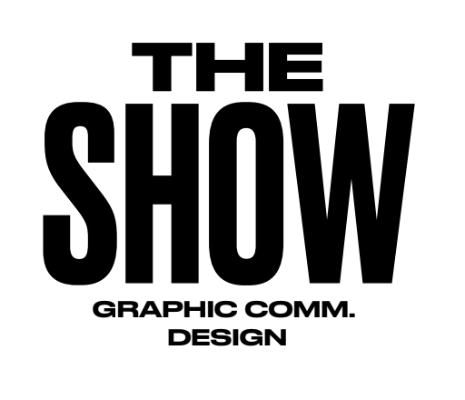
The Show 2018
Event Design & Branding
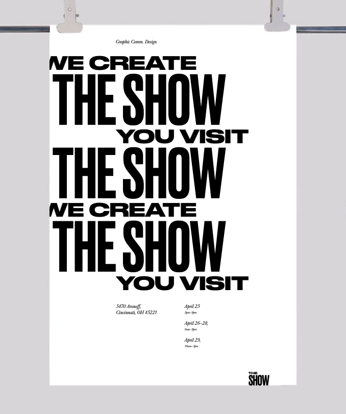
︎ THE SHOW 2018
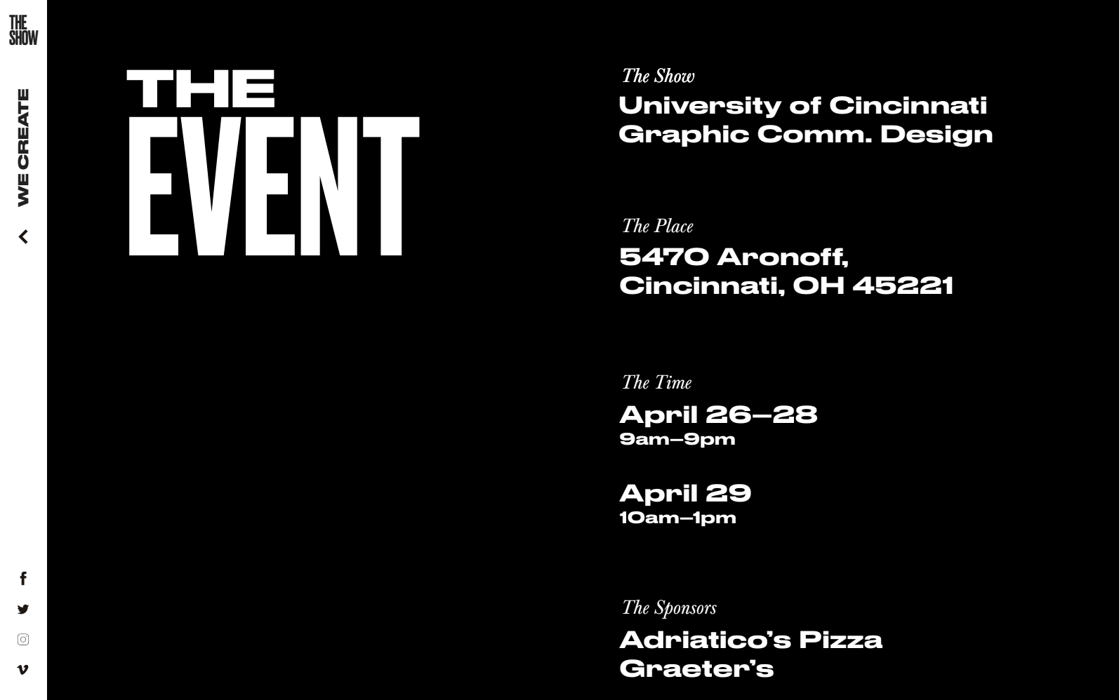
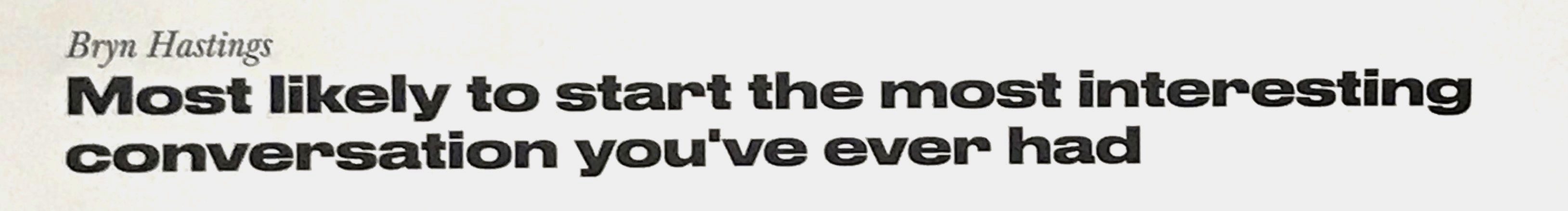
DAAPworks 2018: our senior show. Designed and carried out by the senior class itself, all elements of this project were collaborative in varying degrees. All students wrote proposals for the branding of the show, and my group’s concept was voted the favorite. A smaller group from those who had designed the original concept moved forward to be creative directors for the show.
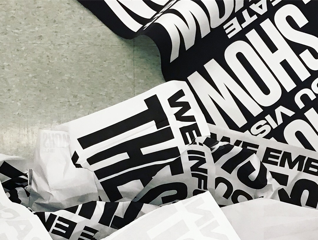
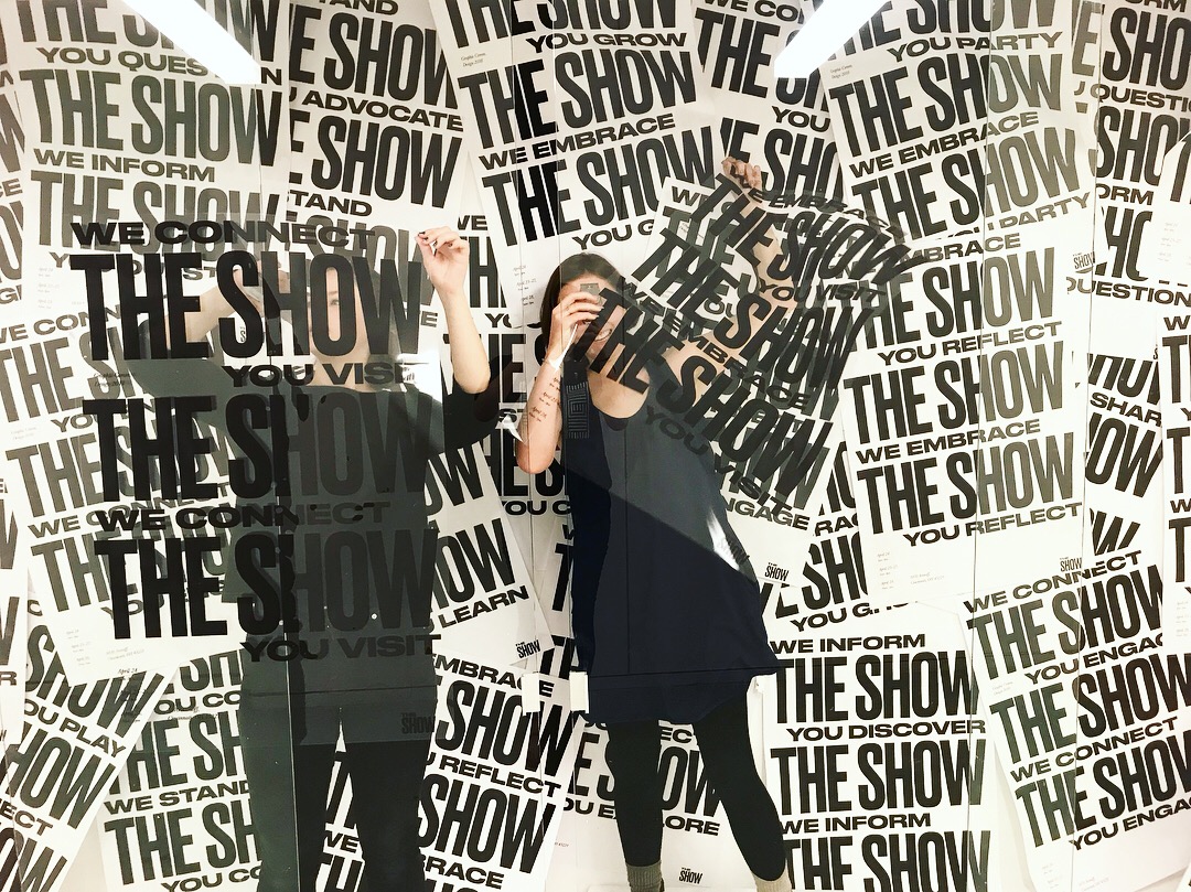
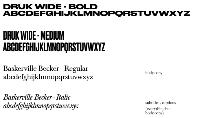
Our concept for the show was a radical divergence from the bright, talkative designs of years past: the purpose of the show is to share our work, so why hero anything else? We worked with the mega-contrasting typeface Druk — which drew varied opinions from students and professors alike — and a stark black and white color palette. The copy took a decisive tone: “We Create, You Visit,” and appeared across the board in the brand activation, which included environmental graphics, a website, print materials, and physical collateral (fortune cookies and matchbooks).
RYAN: Druk is good
RENEE: Druk is not good
Eventually: Okay, Druk is good.