
HELLO!
About
Message me :–)
WORK
Flotsam
Just.
Work is Play Admin.
OCD + Psychedelics
Just.
Branding + Packaging
︎ JUSTPERIODS
︎ with HYPERQUAKE
A new period care brand, straightforward and bold, fearlessly departing from the demure blues and pinks of the “feminine hygeine” aisle. By owning the color red and embracing a no-nonsense tone of voice, the brand proclaims its straightforward intent, with none of the hushed tones employed by many period care brands currently on the market.
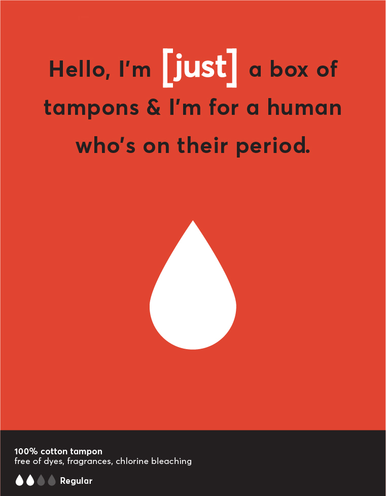
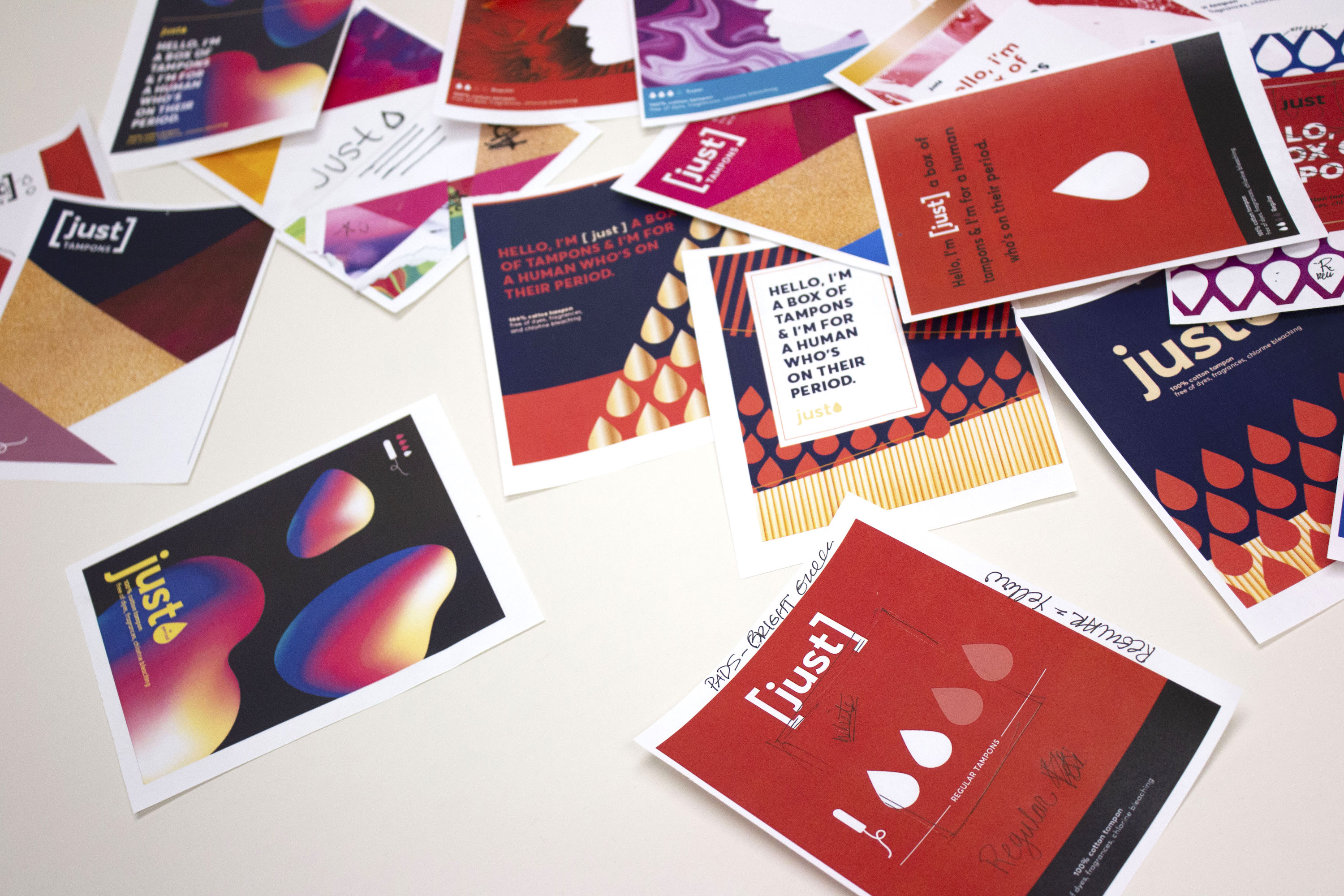
1.
Ideation
The first step in the process of design is to make a lot of ideas. Some will work and some won’t, and both types of ideas are useful. It is through this process of exploration that the path forward starts to emerge. A bold tone of voice starts to manifest as fearless colors and forms; a straightforward message can speak for itself as decisive typography.
![]()
![]()
![]()
![]()
![]()
![]()
![]()
![]()
![]()
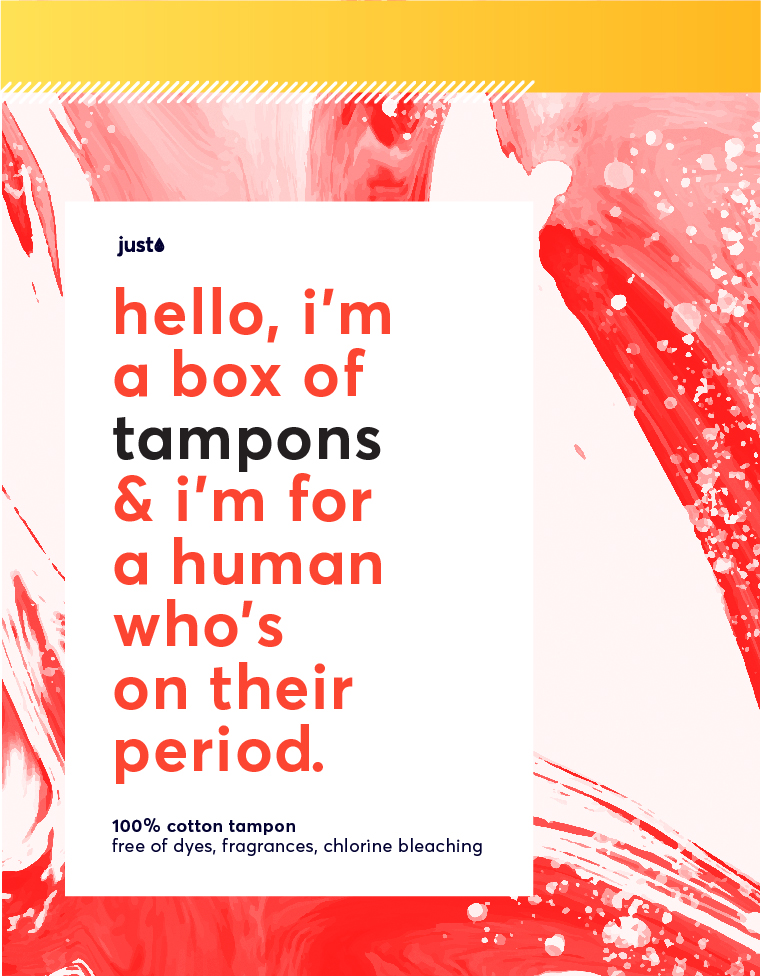
Ideation
The first step in the process of design is to make a lot of ideas. Some will work and some won’t, and both types of ideas are useful. It is through this process of exploration that the path forward starts to emerge. A bold tone of voice starts to manifest as fearless colors and forms; a straightforward message can speak for itself as decisive typography.


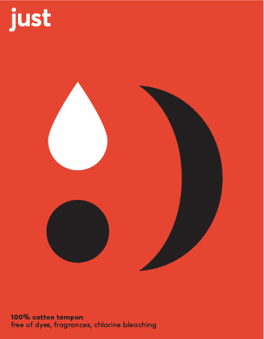
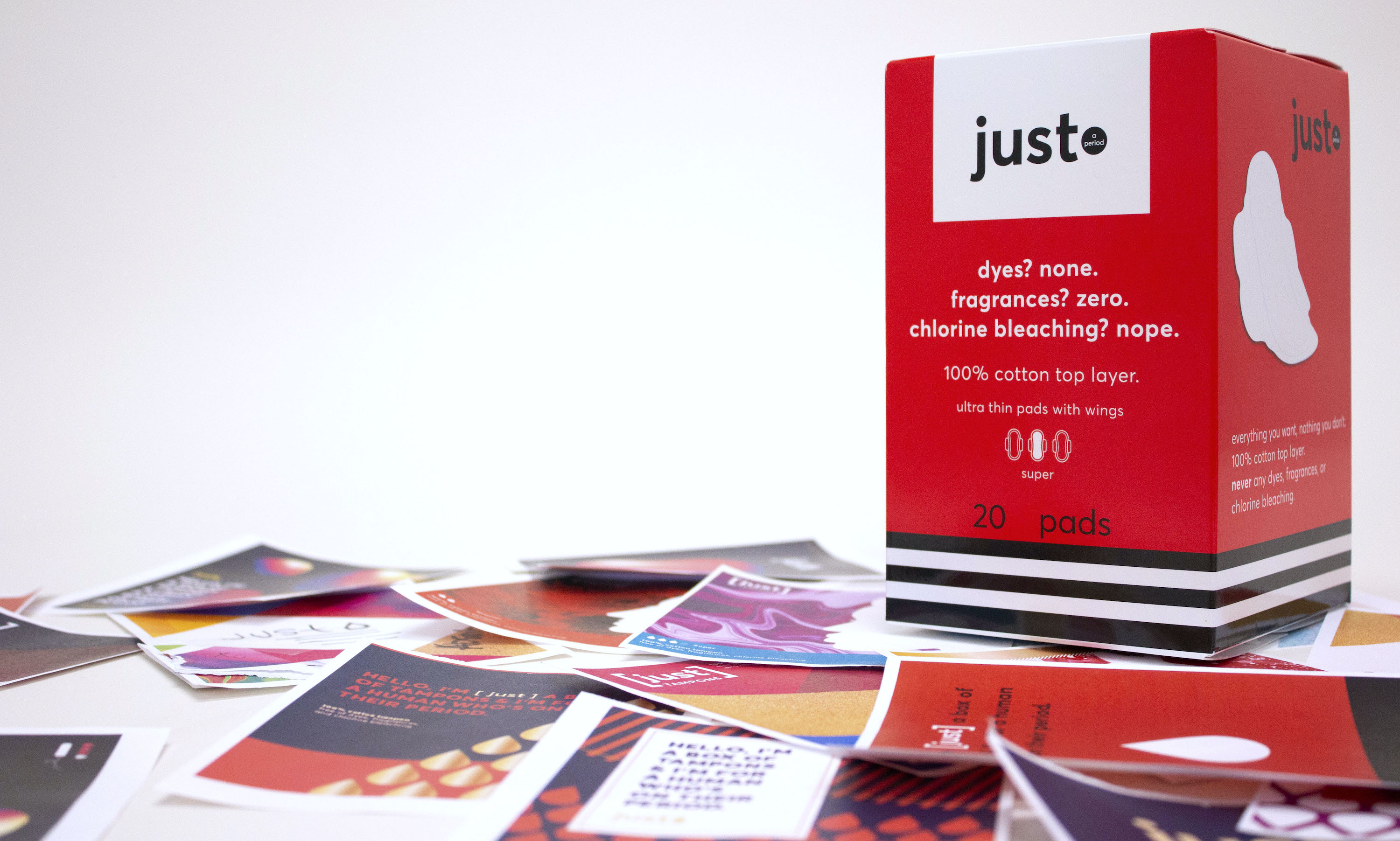
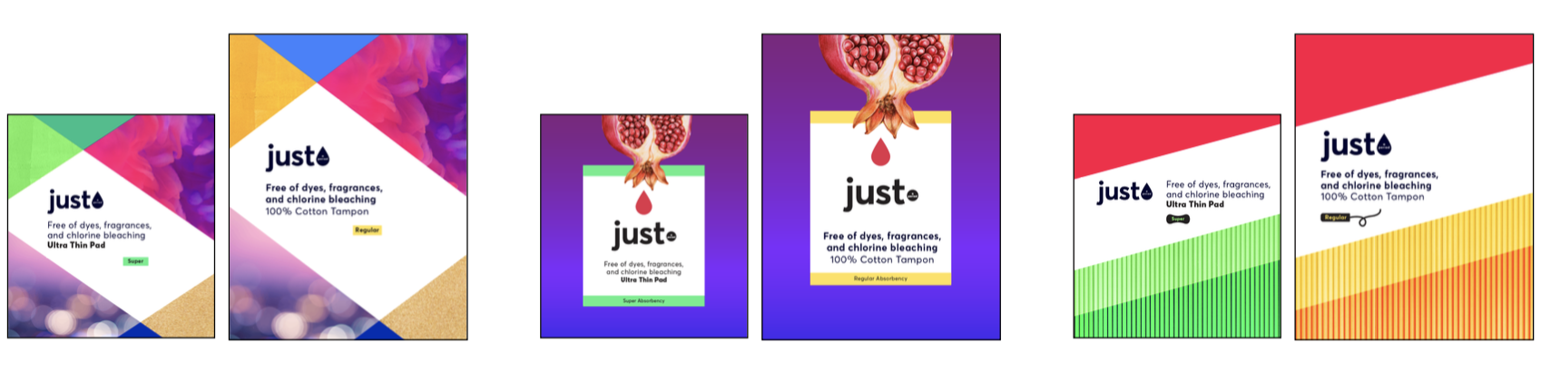
2. Refinement
After aligning on a selection of successful graphic elements, the next step is to refine the options into packaging proposals. Through evaluating these refined directions, we bolster the brand strategy, and start to understand where the final solution may lie.
Refinement
After aligning on a selection of successful graphic elements, the next step is to refine the options into packaging proposals. Through evaluating these refined directions, we bolster the brand strategy, and start to understand where the final solution may lie.

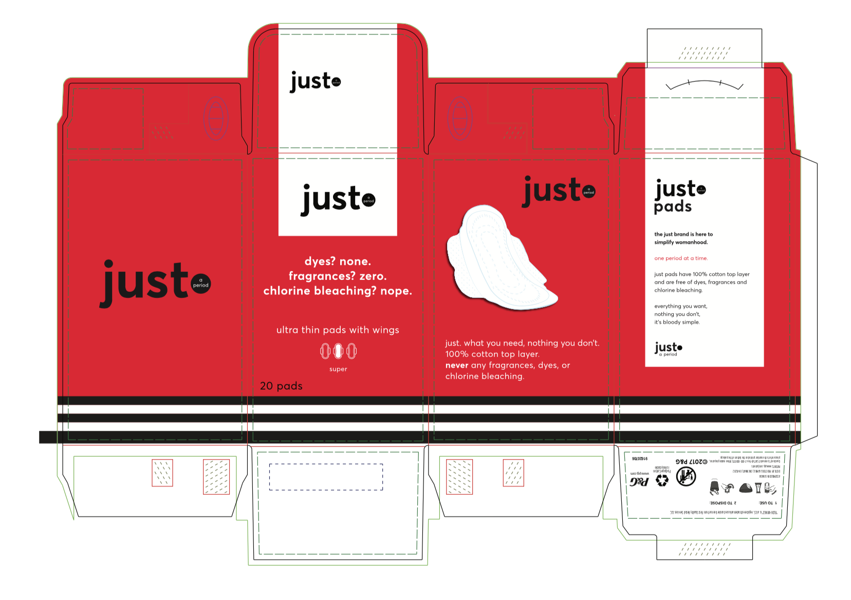
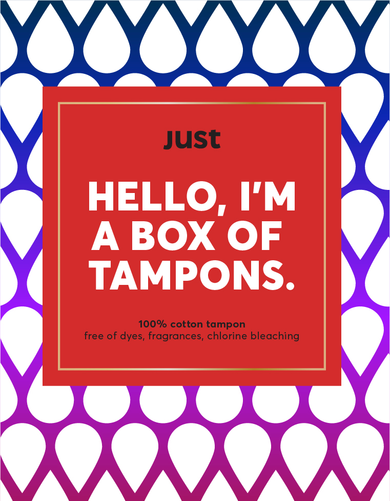
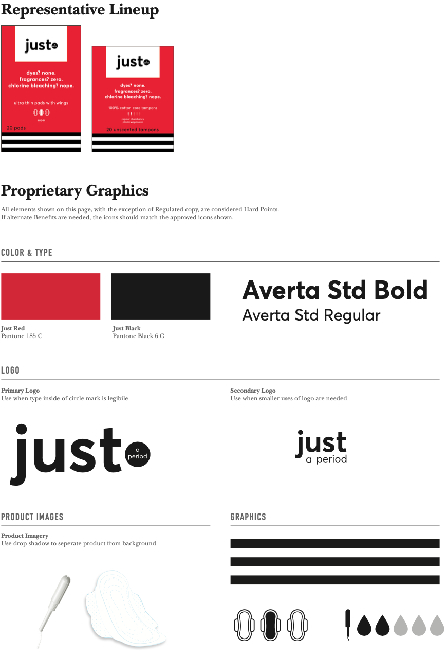
3. Brand Development
Through a multitude of revisions, a final package concept is chosen. It now must be developed into a concrete brand, taking the visual elements and organizing them into a brand guidelines document that will ensure consistency in future activations.
![]()
Brand Development
Through a multitude of revisions, a final package concept is chosen. It now must be developed into a concrete brand, taking the visual elements and organizing them into a brand guidelines document that will ensure consistency in future activations.

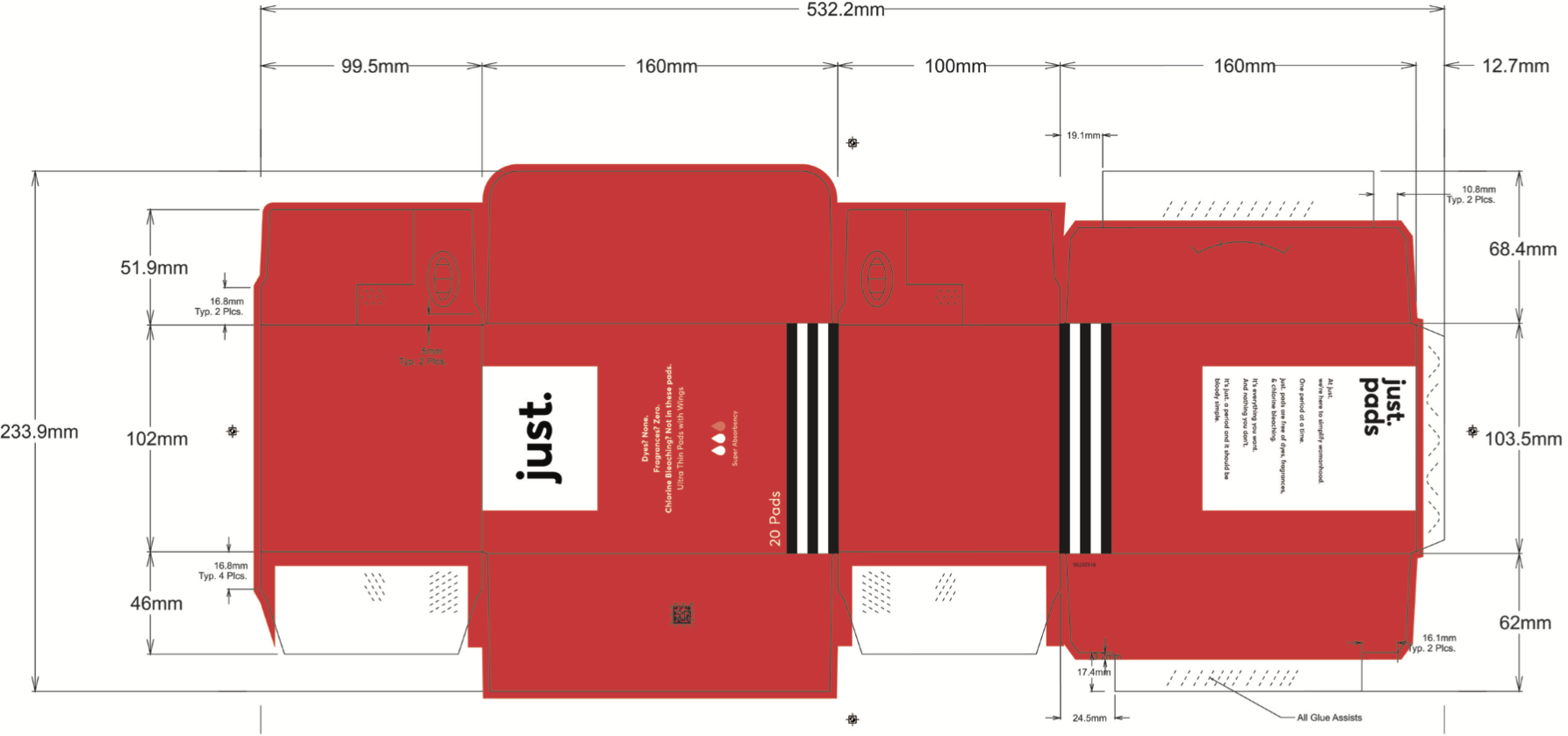
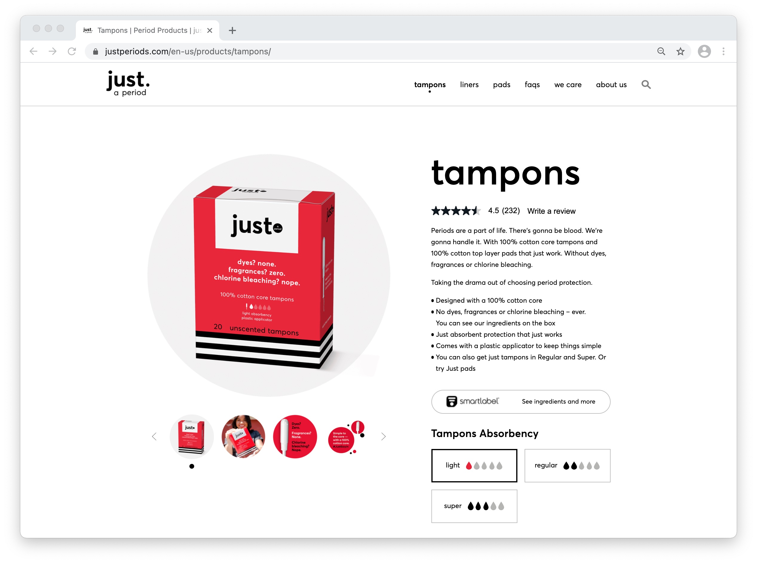
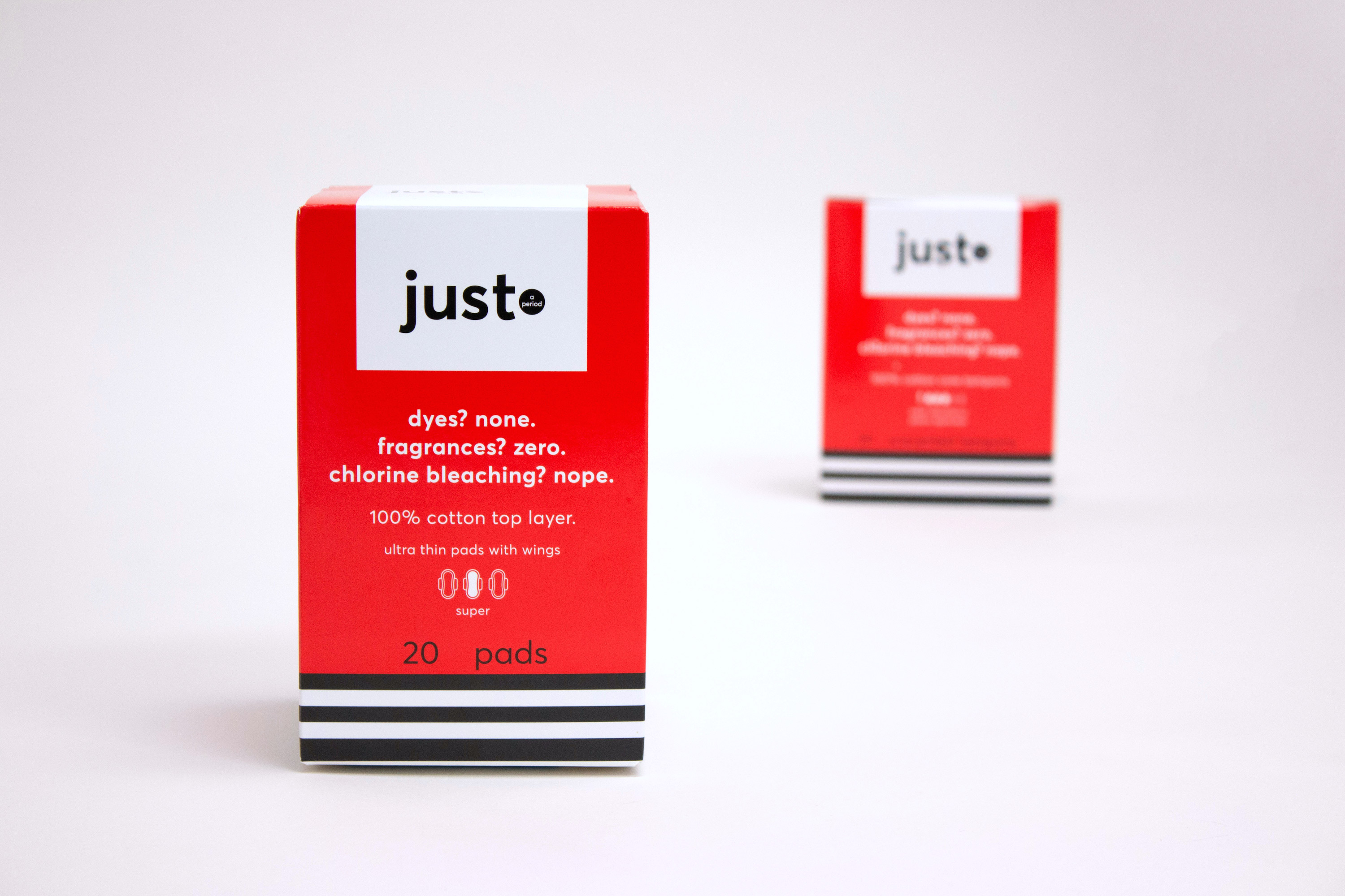
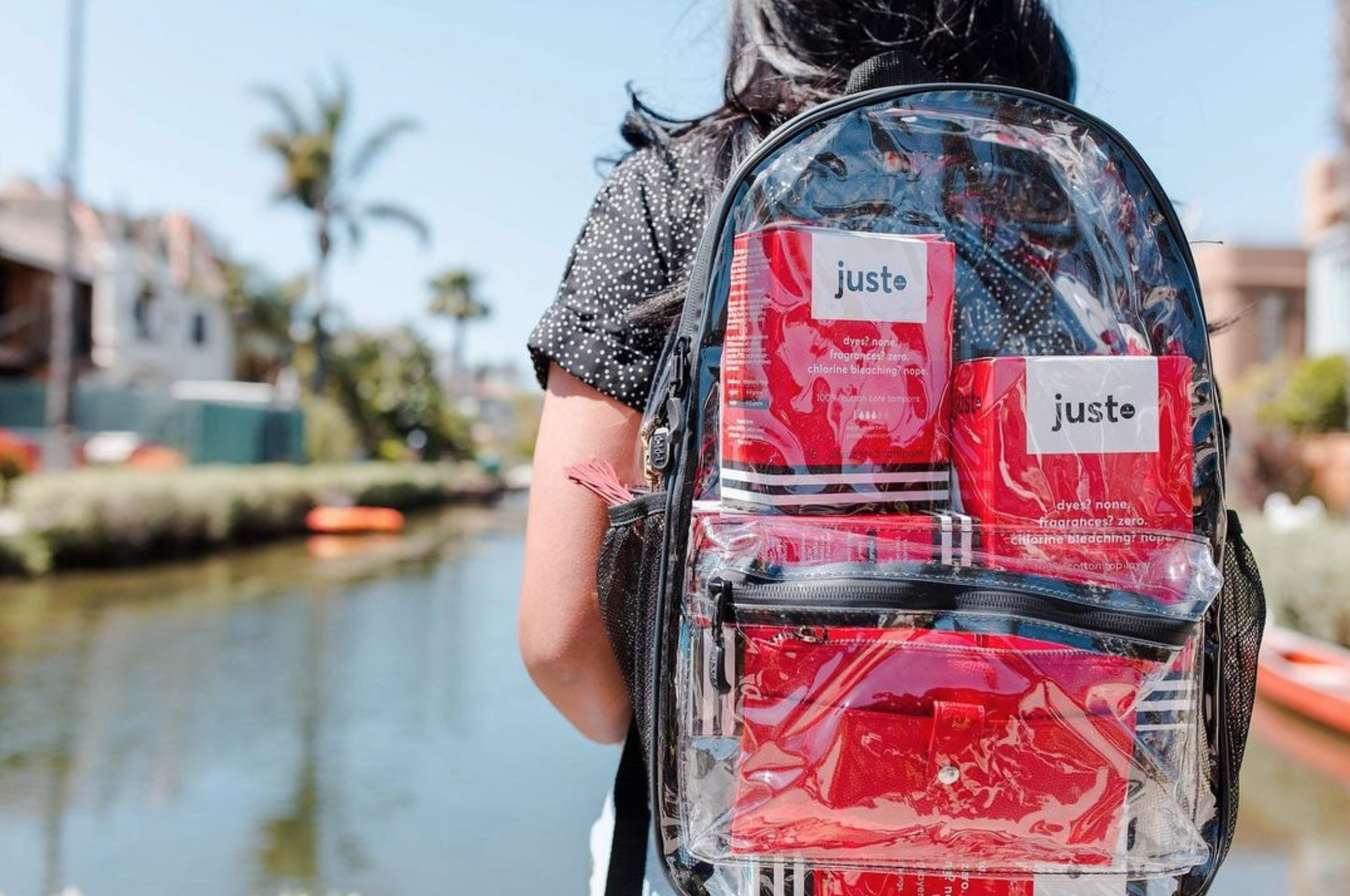
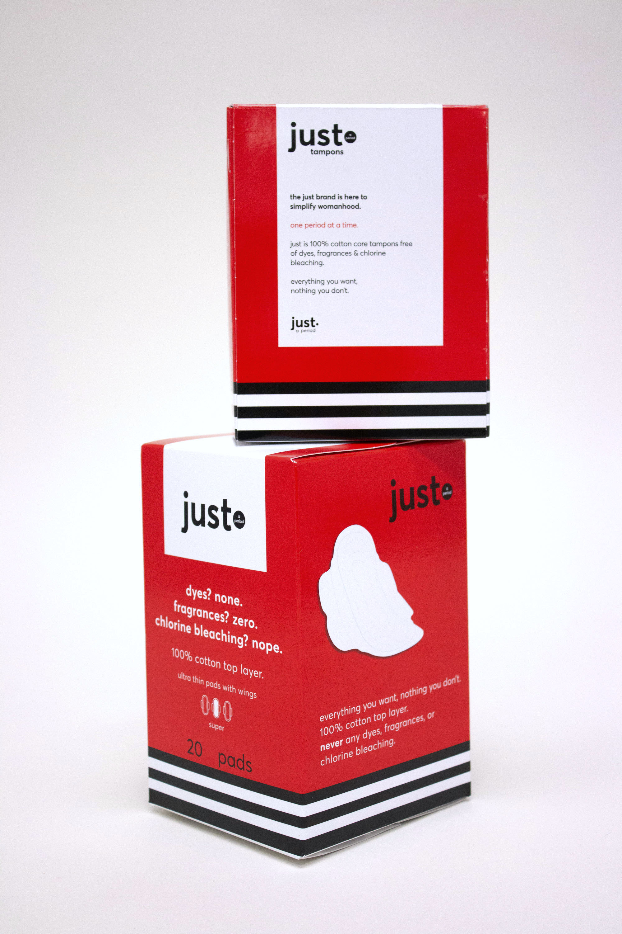
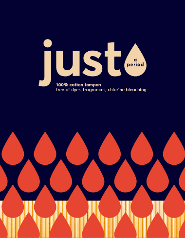
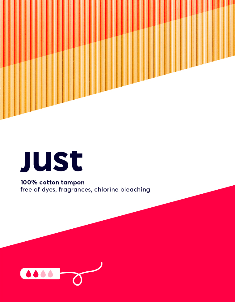
4. Production & Beyond
The brand has been solidified, the packaging concept has been approved, and it is time to create the final file to hand off to production. Our final packaging was developed for both pads and tampons, and is now on shelves.
![]()
Production & Beyond
The brand has been solidified, the packaging concept has been approved, and it is time to create the final file to hand off to production. Our final packaging was developed for both pads and tampons, and is now on shelves.