
HELLO!
About
Message me :–)
WORK
Flotsam
Just.
Work is Play Admin.
OCD + Psychedelics
Selected Branding
The solution in design can always be found in answering the questions: “What is your goal? Your purpose? Your intent?”
INDEX:
P&R
American Heart Association
Speculative Femcare
Austomotive Aesthetic
Wellness Mastery
Tampax
Mastercraft
Western Dental
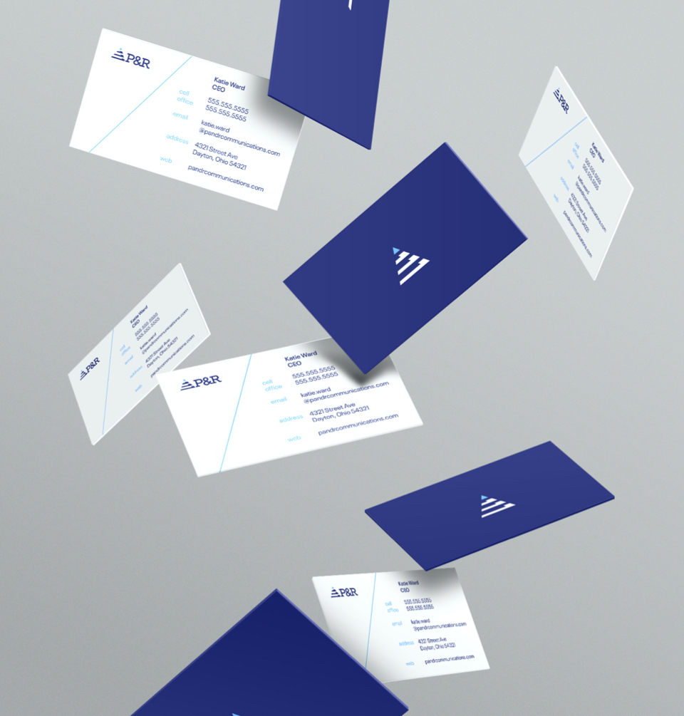
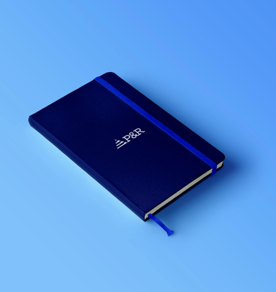
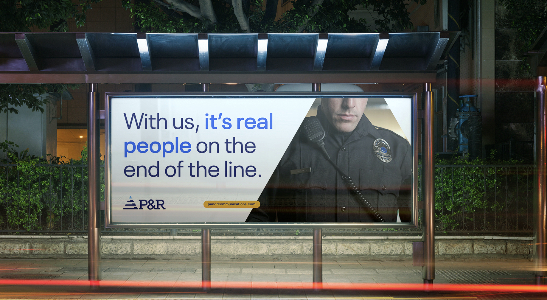
P&R
︎ with HYPERQUAKEThe brand P&R Communications has a rich heritage and loyal audience. Updating this well-loved brand requried special attention to past equity, to bring forward their key attributes to a larger user base, through highlighting the company’s outstanding service, loyalty, and dedication to their craft.


 PATHWAY 01 To pay homage to company heritage, elevating original colors and iconic simplicity.
 PATHWAY 02 A visual representation of synthesis, organization, and ultimately connecting the world.
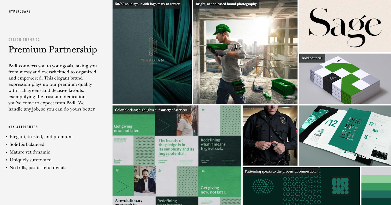
PATHWAY 03 Elevating P&R’s dedicated parternship and ultimate dedication to client happiness.
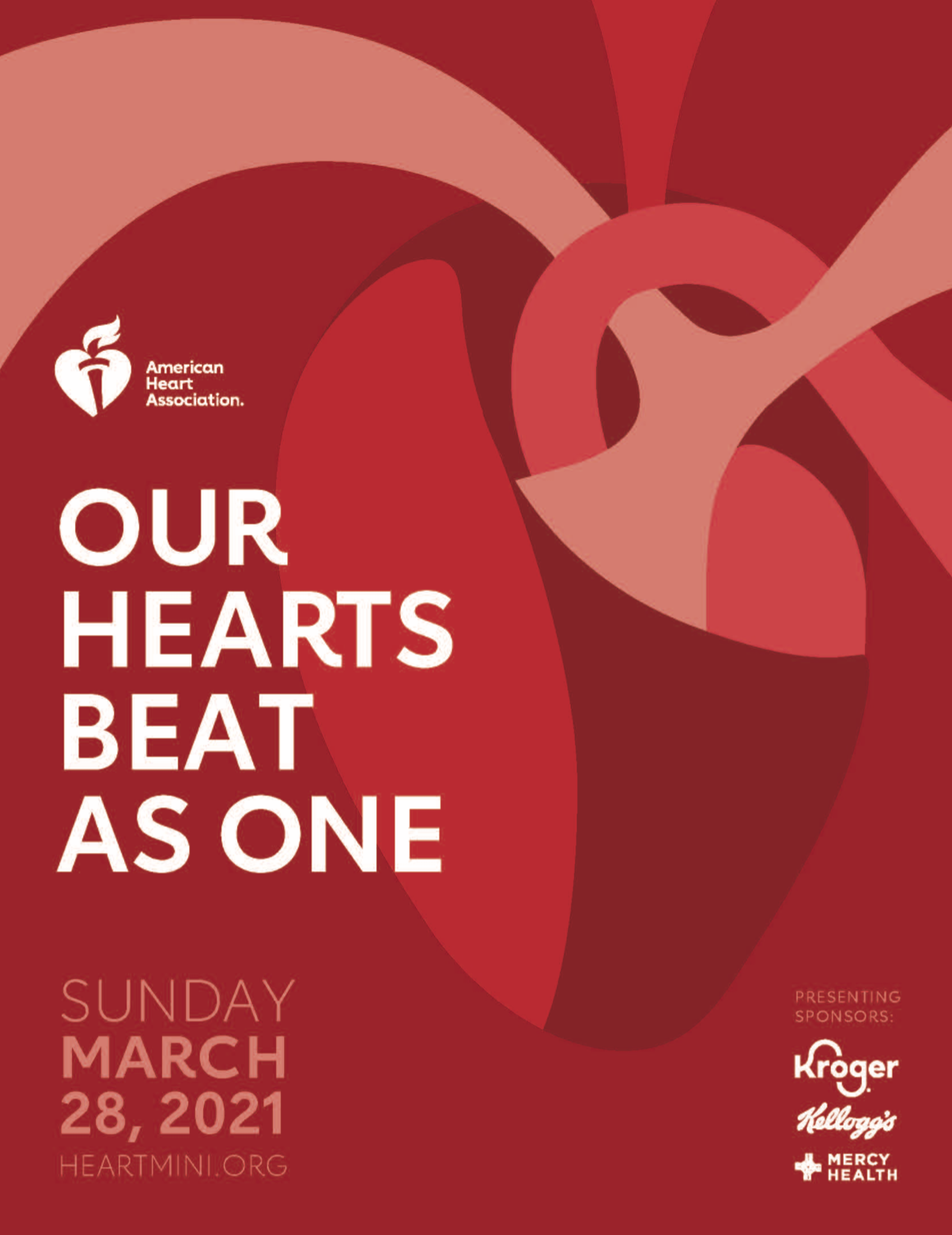
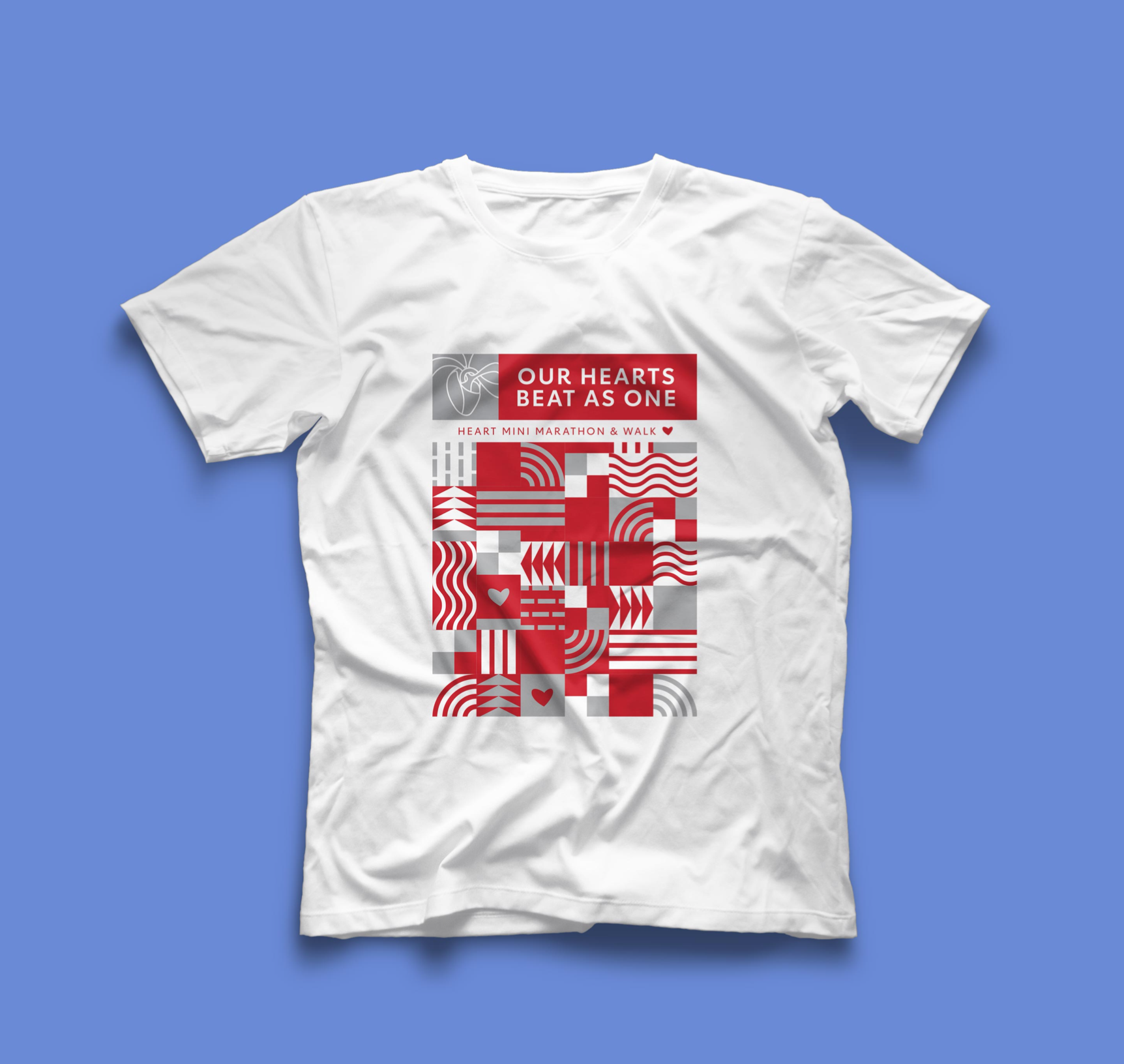
American Heart Association 2021
︎ AHA WEBSITE︎ with HYPERQUAKEThe 2021 American Heart Association events are a tesselation of purposes, individuals, and life paths — all coming together to form one unified goal. The 2021 AHA branding speaks to individuals coming together, their unique passions overlapping to create a powerful force of love and support.


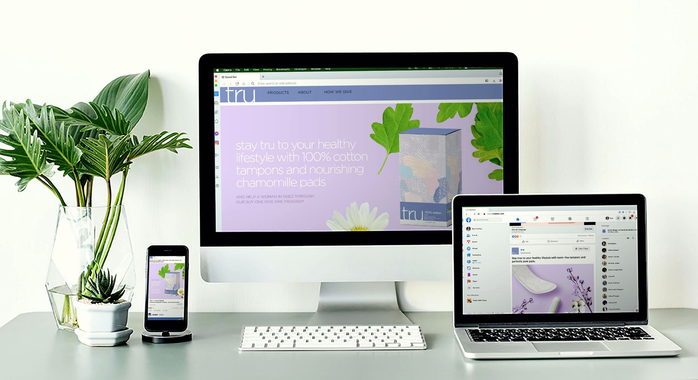
Speculative Femcare Positioning
︎ with HYPERQUAKEAiming to innovate in the femcare space, this project was an exercise in evisioning and differentiating various potential brand outputs.
Right: Selected brand expressions. With the conceptual basis of sisterhood, inclusion, and an engaging friendly energy, there were multiple visual interpretations that I thought could be viable solutions.


Automotive Aesthetic
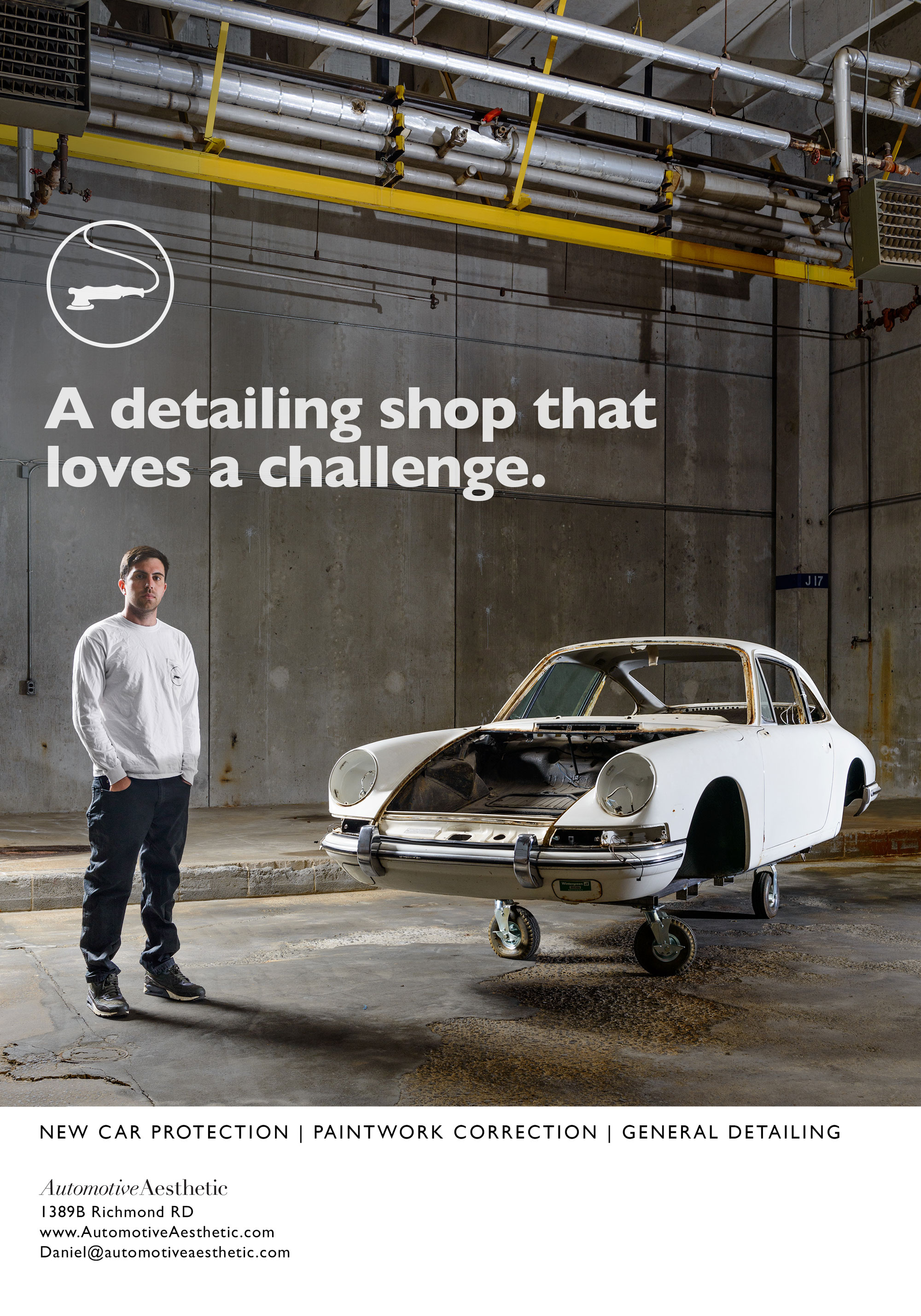
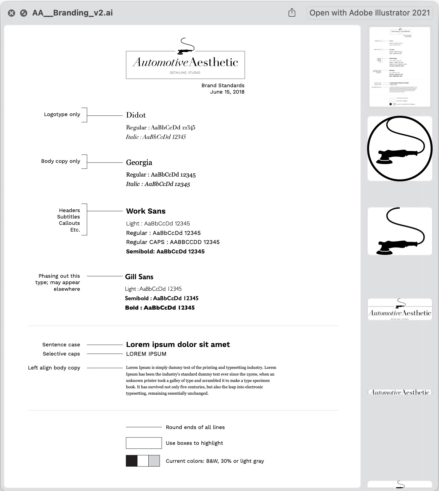
︎ AUTOMOTIVE AESTHETICLocated in Charlottesville, VA, this small team brings huge passion for their work and a great eye for detail. Their brand is clean and precise, just like the work they produce.
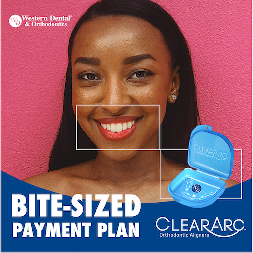
Western Dental
︎ WESTERN DENTAL
︎ with HYPERQUAKE
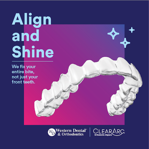
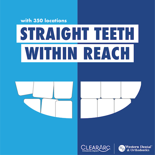
Branding exploratory for dental care provider Western Dental. Each image represents a different visual pathway, for the purpose of facilitating discussion in refining brand presentation.
Branding exploratory for dental care provider Western Dental. Each image represents a different visual pathway, for the purpose of facilitating discussion in refining brand presentation.


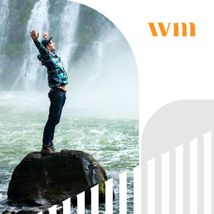
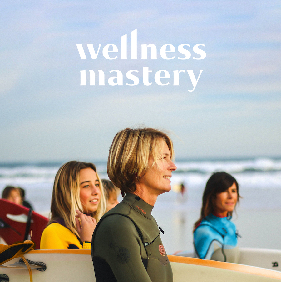
Wellness Mastery
︎ with HYPERQUAKEBranding exploratory for an emerging holistic health brand. Drawing from an vivid springtime color palette, these snapshots explore potential look/tone/feel through social media assets.


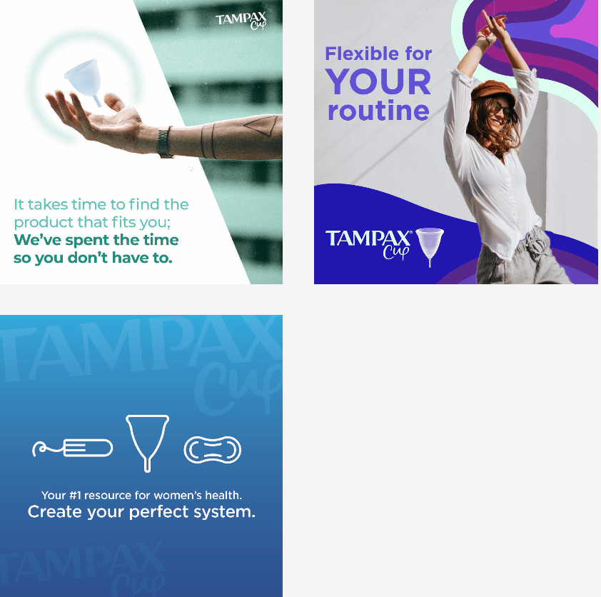
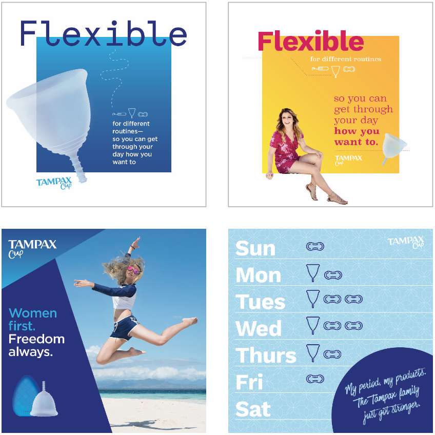
Tampax Cups.
︎ TAMPAX︎ with HYPERQUAKE
Menstrual cups are an innovation that continues to convert users. For Tampax to enter the conversation they must define their unique point of difference, especially in a category populated with various independent brands.


PATHWAY 1
Freedom benefit
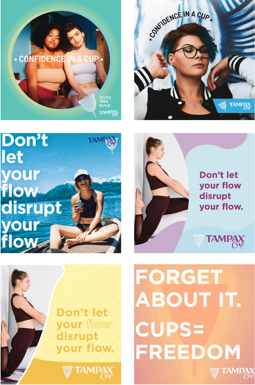
PHYSICAL FREEDOM TO GO ABOUT MY DAY UNINTERRUPTED
PATHWAY 2
Management benefit
A BETTER WAY TO MANAGE MY HIGH NEEDS
PATHWAY 3
Simplify benefit

TO BE ABLE TO SIMPLIFY MY LIFE
PATHWAY 4
Health benefit

TO KNOW THAT I AM USING A PRODUCT THAT WON’T HARM ME
PATHWAY 5
Independence benefit
TO HAVE MORE SAY AND INDEPENDENCE IN WHAT I USE
PATHWAY 6
Investment benefit
TO INVEST IN THINGS THAT ARE GOOD FOR ME AND PAY OFF
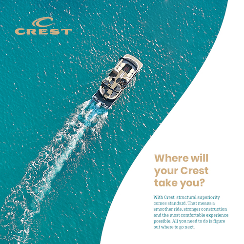
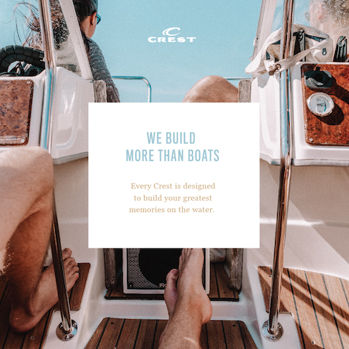
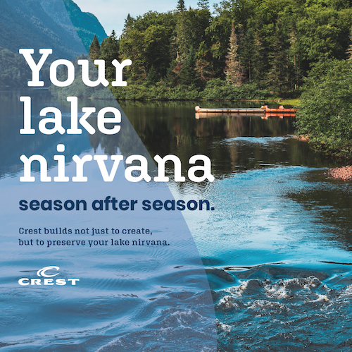
Crest by Mastercraft
︎ MASTERCRAFT︎ with HYPERQUAKE
Branding exploratory for positioning a new boat release. Each image represents a different graphic language, exploring different photography and type for the purpose of facilitating conversation as the campaign is crafted.